


Canatta
In 2017, Canatta & Asociados was created, formed by a couple with extensive experience in real estate. Such is the case of Diego and Milca, who merge their knowledge in construction and business, respectively.
Branding
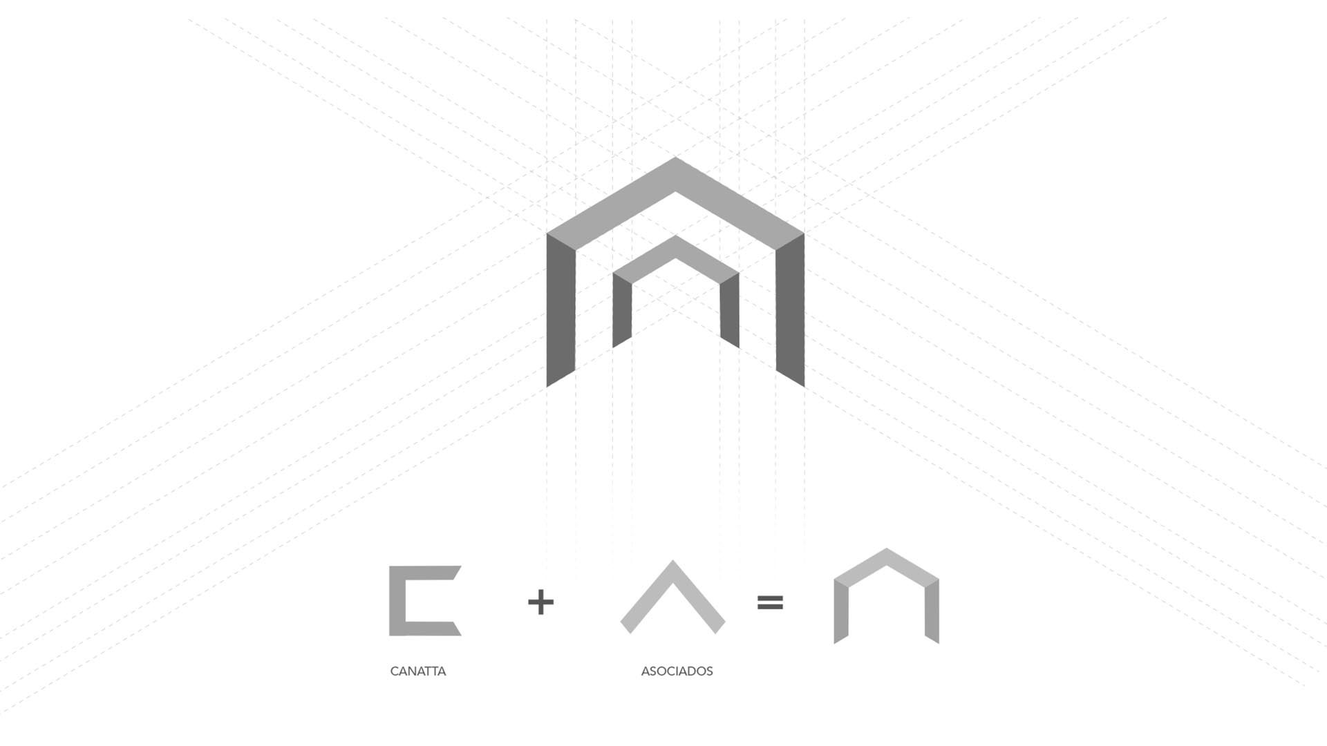
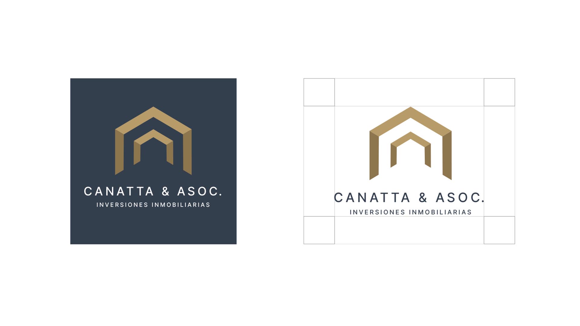
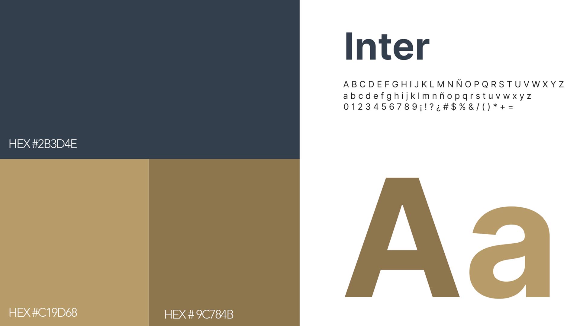
The logo represents the union of the initials C+A, which, with earthy tones and geometric shapes, rise, conveying a solid synthesis of building and construction. This is due to the ascending lines that form an arrow pointing to the sky. As a secondary color, a sober blue tone is chosen, representing security and trust.
The application of the logo extends from stationery prints to personal protective equipment and digital media, maintaining a constant presence on social media.
︎
